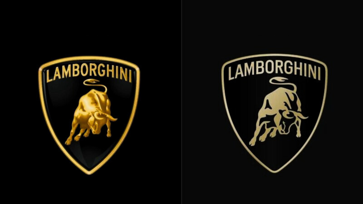
Lamborghini, the luxury vehicle manufacturer, has changed its emblem to reflect its new marketing objective of “Driving Humans Beyond.” This logo modification took place after twenty years. The former logo was intricately designed with a 3D look. The emphasis has shifted to decarbonization and sustainability – ‘Lamborghini Centro Stile’. As a result, the company aims to position itself uniquely in the niche luxury car market.
Lamborghini is an Italian luxury sports car and SUV manufacturer headquartered in Sant ‘Agata Bolognese. Lamborghini Trattori, founded in 1948 by Ferruccio Lamborghini, is headquartered in Pieve di Cento, Italy, and continues manufacturing tractors. Lamborghini Trattori has existed as a separate entity from the vehicle manufacturer since 1973. Audi, a unit of the Volkswagen Group, owns the firm.
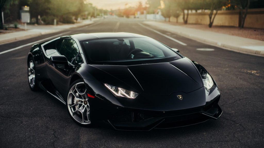
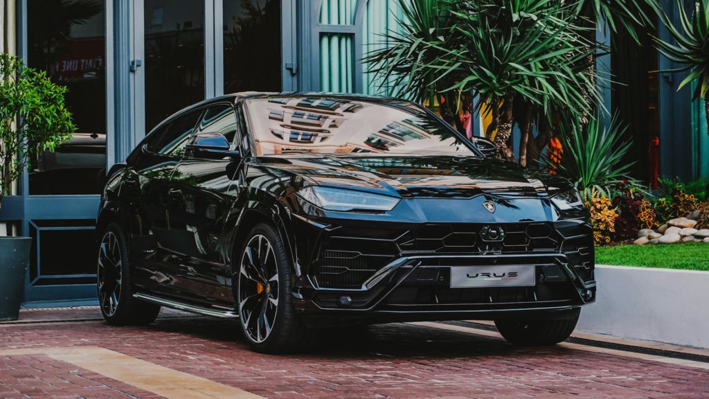
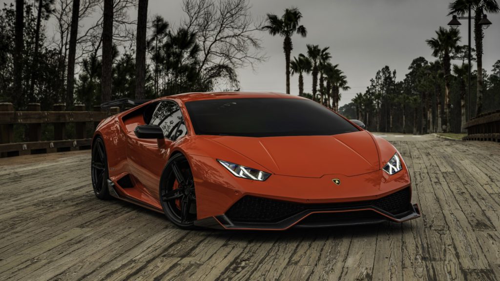
Ferruccio Lamborghini (1916–1993), an Italian manufacturing magnate, founded Automobile Ferruccio Lamborghini S.p.A. (Company with Shares) in 1963 to compete with Ferrari. The company was well-known for using a rear mid-engine, rear-wheel drive configuration. Lamborghini currently manufactures the V10-powered Huracan, the Urus SUV powered by a twin-turbo V8 engine, and the Revuelto, a V12/electric hybrid available in 2024. Furthermore, the firm manufactures V12 engines for offshore powerboat racing.
Bullfighting plays a significant part in Lamborghini’s identity. In 1962, Ferruccio Lamborghini visited Don Eduardo Miura’s Seville ranch, a well-known breeder of Spanish fighting bulls. Lamborghini was so captivated by the majestic Miura animals that he chose a raging bull to represent the automotive company he was about to start.
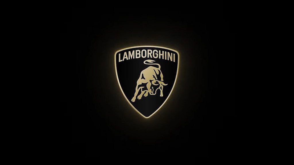
Because of the new branding initiatives, the corporation focuses more on producing cars in a way that reduces carbon emissions. The new emblem reflects the company’s new approach to car manufacturing, and hence it is more than just a redesigned badge. The company also revamped the logo design as part of its brand transformation process, saying that the new logo matches the brand’s value of being ‘brave, surprising, and real.’ The redesigned logo has a larger Lamborghini font than the previous one, as well as simple but eye-catching colors. Black and white remain the core colors, signifying the brand’s identity, but yellow and gold bring vibrancy and flair. Aside from the emblem, Lamborghini has launched an official font inspired by the distinctive designs of its vehicles, expressing the company’s style and ideals. Revuelto is the brand’s trademark, which combines classic and modern designs and features.
The redesigned logo has a larger Lamborghini font than the previous one, as well as simple but eye-catching colors. Black and white remain the core colors, signifying the brand’s identity, but yellow and gold bring vibrancy and flair. Aside from the emblem, Lamborghini has launched an official font inspired by the distinctive designs of its vehicles, expressing the company’s style and ideals. Revuelto is the brand’s trademark, which combines classic and modern designs and features.
